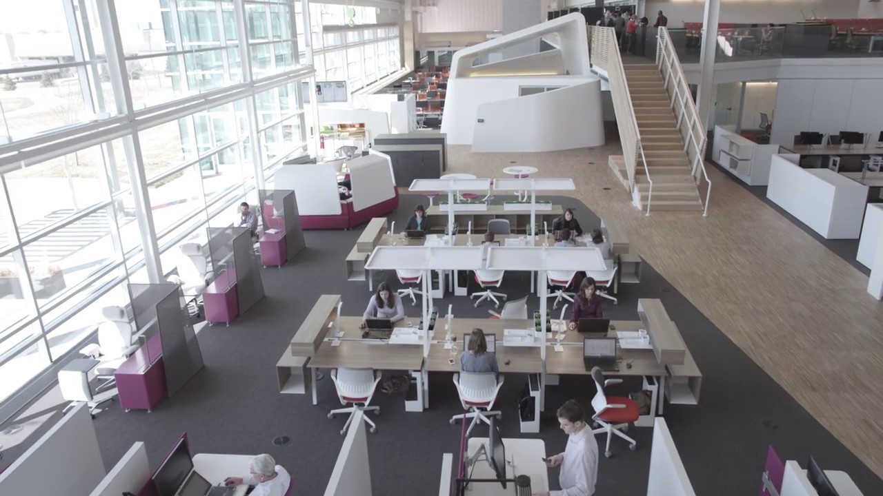
Color schemes for commercial Ofiice space

Colour can influence mood, productivity, culture, and connectivity – it can make or break your design. The right office colour schemes can also make a statement about a brand’s image – the mood it seeks to inspire it its customers, the energy it seeks to ignite in its staff, and the zones that support a variety of functions and flow within its space. Colour synchronised with texture is perhaps the most influential and powerful element of commercial interior design. But power doesn’t necessarily mean dominance. Subtle bursts of colour can transform a neutral canvas into a high-energy hub, a contemplative nook, or a social space for networking or collaborating with co-workers. Colour can lift, ground, ease, or inspire a workforce. The Color Effect Blue The vibe: Calming, promotes trust, communication and focus. Ideal in: Spaces where head down work is needed. Yellow The vibe: Optimistic, stimulates the spirit and promotes inn...


